Brand: Arbol (Automotive
Lubricants) & SPL (Industrial Lubricants)
Client: Arabian
Petroleum Ltd.
Agency: ShyBuzz
Role: Brand
Consultant
Deliverables: Creatives,
Social Media, Website, Content, Corporate Literatures, Labels, Stall Design,
E-mailer, Stationery, Ideation, Proofreading etc.
Arabian Petroleum
Ltd.
Arabian Petroleum is an ISO 9001-2000 certified company that
has been accredited both by The United Kingdom Accreditation Service (UKAS) and
CRISIL. The company is a manufacturer of
quality products that comply with statutory requirements and confirms to all
the regulatory and quality parameters under the brand name of Arbol (Automotive
Lubricants) & SPL (Industrial Lubricants).
The company is renowned for its effective application of systems
and processes, creating enduring quality and conformity that has helped it
establish a pride of place in the industry. It has rapidly grown and set a high
benchmark in the industry with their specialised products , SPL - Makes Your
Machine Smile, and ARBOL - Expert’ s Choice Premium Quality Lubricants.
Brand Brief
Arabian Petroleum Ltd. had established itself as a prominent
and respected name in the industry with their SPL brand. The company were about
to introduce their new brand of automotive lubricants, Arbol, and were also
looking to initiative a major rebranding and repositioning exercise that
reflected the growth of the company that reflected the quality, service and trust
the brand, and the therein the parent company, had built up over time.
Corporate Identity
One of the major requirements from ShyBuzz was to come up
with a corporate identity that seamlessly combined the major elements that
together made up the crux of the entire company’s overall brand image. It
needed to give the company the visual identity that conveyed the overall
structure of the company without it being too cluttered, staying true to the industry
it was part of, and representing the professionalism and quality that the
company prides itself on.
ShyBuzz Approach:
The challenge facing Team ShyBuzz was
making the new brand identity as simple as possible yet aligning meticulously
with all the values and emotional connect the brand and the company
represented.
After methodical deliberations and creative pondering, the
answer was found amidst the most common element the industry stood for – gears.
In isolation gears might not serve the greatest of purpose, but when it comes
together it can move the greatest of things with the spin at its command – all
this made possible and easier by – Yes! Lubricants.
Also, just as the gears, the three important elements came
together to create something that is greater, better and more effective as one,
yet individually played it part to a t. The company, Arabian Petroleum Ltd.,
and its two brands, Arbol & SPL respectively came together as in the finest
of machines to deliver optimal performance, driven by the core product that is
at the centre point of the company.
Website:
The brief of Arabian Petroleum Ltd. intended the site to
have two microsites for each of the brand. Each microsite needed to have its
own unique style and feel that individually represented the unique traits and
proposition of the brand vis-à-vis its look, content, design, and overall value
the individual brand stood for.
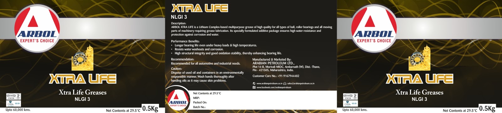
Labels:
Arabian Petroleum had and were about to introduce a whole
host of products, either new or repackaged, with a plethora of individual
specifications, applications, purposes and usages etc. Each product, many with its
own sub-ranges of products, varied from Automotive Lubricants, Industrial
Lubricants, Textile Oils, Greases, Transformer Oil, Speciality Products etc.,
all encompassed under the Arbol and SPL brand of Arabian Petroleum.
The seemingly imposing task at hand was to give every
product and its variants and sub-products due credence and emphasis, in keeping
with its characteristics and properties. It was therefore important to
understand the very nature and functionality of the product before setting down
to give the label its identity. The ultimate look and feel of the label proved
to be worth the effort with every label being appreciated for its corporate and
professional look, yet being attractive and unique.
Content:
The content for the company and brands required a great deal
of research as well as incessant study to have the right base to be able to bring
together all the mosaic of technicalities and complex structure of the company with
respect to its brands and its respective products, to be able to put it into
words.
The tone of the content
- be it for website, brochure, technical book, social media, banners, ads,
stickers, stall, presentation, exhibition panel etc. - needed to be
professional, yet be understandable to the varied ensemble of audience it was intended
for.
After the initial draft we were able to narrow down to a
language that we realized was both engaging and informative. The content was
intended to balance facts with brevity yet saying all that it needed to say
without sounding preachy or even incomplete. In this pursuit the team at
Arabian Petroleum proved to be highly helpful through their detailed brief,
feedback and updates.
Social Media:
In keeping with all
the other facets of the visual communication for the company, the social media
part of the communiqué also needed to be carefully calibrated and adapted to
the audience and industry it was intended to.
The approach ShyBuzz took was a minimalistic approach that
appealed to the majority of the target audience. It communicated with the fan
base through direct and indirect posts that not only encouraged engagement but
also facilitated the growth in interest towards the company, its brands, and
products.
Brochures, Technical
Booklet, Mailers & Ad Creatives
Team ShyBuzz had a great volume of data and information to
work with. The trick was to get it organised and structured enough without it being
inconsistent and incoherent. It was decided that the best way forward will be
to use only as much information as was required for individual company literature.
For example, pamphlets will have minimal data so as to give
an overall perspective, with brochures expanding on the amount of information without
missing out any of the most important features and component of the brand essentials,
with the technical booklet proudly boasting of the maximum data that one is
likely to need to have a detailed understanding about all the miniscule aspect of
the company and its whole host of products.
Lastly but not the least, Ads, the primary function of
which, as is the case with all the ads primarily, is to arouse interest in the
brand, with emailers acting as the medium that not only updated the interested
audience about new launches and other company and industry updates, but also facilitating
brand recall and top-of-mind awareness by prompting regular opt-in
communication and value driven interaction.
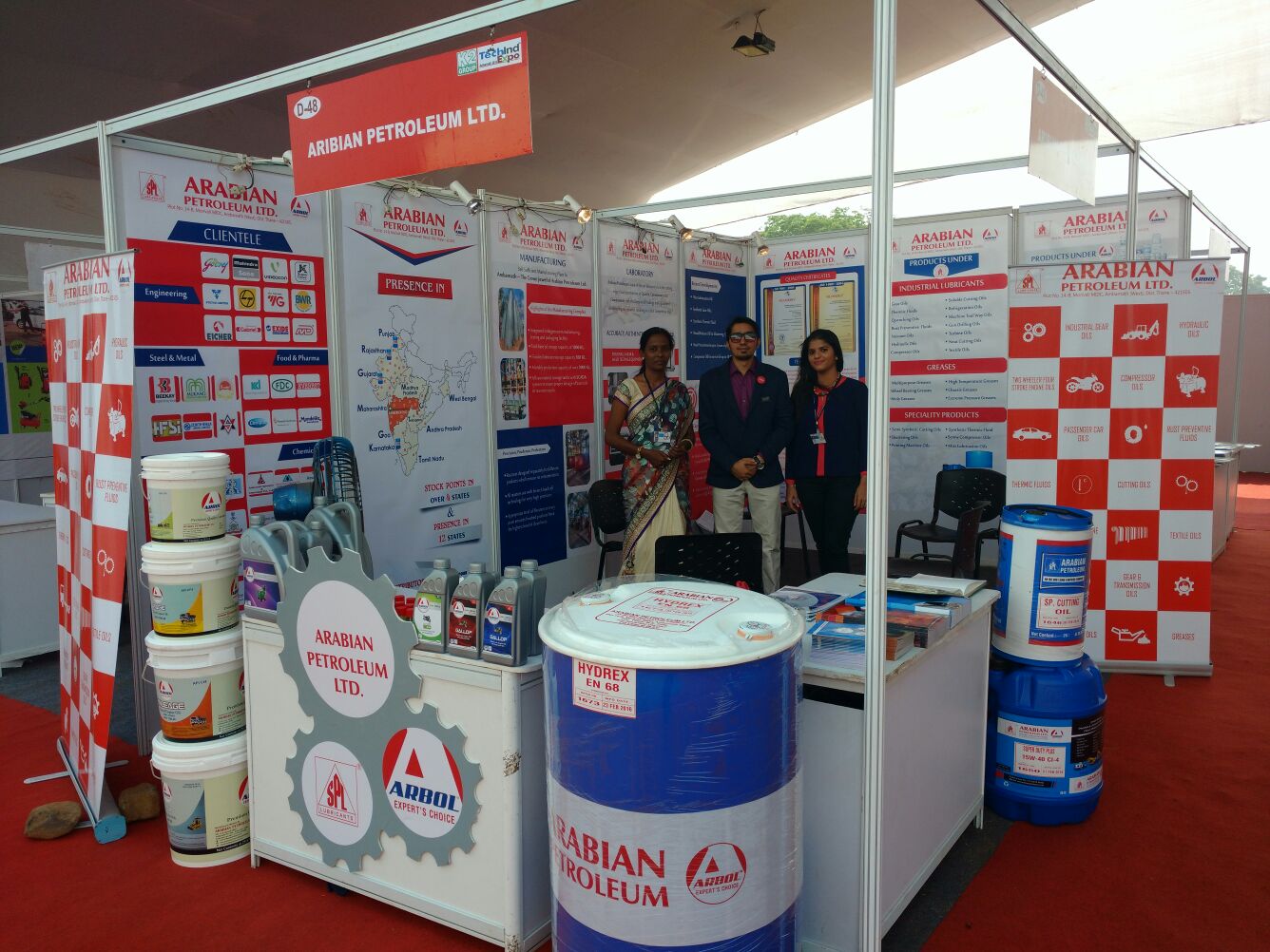
Exhibition Stall
& Panels
Both Team Arabian Petroleum & ShyBuzz realised the
importance of reaching out and meeting clients, potential customers,
distributors and affiliates etc. It is undoubtedly appreciated that it is
during these interactions that companies are able to gauge the pulse of all the
important components and essential partners that come together to build a truly
successful business.
In keeping with this commitment to regularly meet, interact,
discuss, plan and deliver, Team Arabian Petroleum and ShyBuzz worked together
on a smart yet wholesome design and communication architecture that best put
forward all the highlights, credentials, services, high quality & standards,
divisions, infrastructure, team & expertise, along with all the USPs, in a specialised
communication package that both informed and impressed the prospective visitors
to the expo/exhibition.
The whole process, from diligence to execution was a
rewarding experience, which was made all the more special with the exciting
response Arabian Petroleum continues to receive at industry meets and
gatherings.
The journey so far with the entire team at Arabian Petroleum
has been nothing short of path breaking and fruitfully wholesome. We are sure this
journey of learning and growth is only set to get stronger and more productive
in many more ways than one.
We welcome everyone to come review our work, and the entire
team at ShyBuzz, looks forward for a meaningful and fruitful feedback that has
always been at the primary pedestal of our progress.